During the holidays many Americans reacquaint themselves with the large maps found in the walkways of shopping malls and airports. Looking at the building’s layout from a birds-eye view, your eyes first gravitate towards the “You Are Here” bubble denoting your current location. By locating yourself on the map you can then visualize the path to your desired destination. A birds-eye view is not a natural way to envisage our route, but by changing our perspective it enables us to obtain a better idea of what we might find around the corner.
We encounter a similar phenomenon in markets. Following daily market movements in the media can be bewildering. A few days of 0.5% price declines can be followed by a 1.6% increase without a consistent explanation or logic.
Investors can adopt a useful change of perspective by examining historical valuation metrics. Valuation metrics come in many different forms, but in general they attempt to measure the amount investors are paying for ownership in particular companies, or the price of stocks, with relation to how much these companies earn in a given year.
While there are countless varieties of these metrics, one of the most commonly cited is the Shiller CAPE ratio. The CAPE ratio, or the cyclically adjusted price earnings ratio, was created by Yale economist and Nobel Laureate Robert Shiller. This metric measures stock prices with relation to an average of 10 years of stock earnings.
Investors like this number because it measures valuations over the full length of a typical business cycle. This ensures it encompasses both good and bad years for earnings and makes it more suitable for historical comparison. The higher the ratio, the more likely it is that long-term returns will be poor. You will find the formula below:
CAPE = Price / Average Earnings for 10 Years Adjusted for Inflation
What does this data look like today? You will find historical CAPE data arranged from largest to smallest in the table below. The green bar in the middle represents our latest CAPE number, which is a little above 30. The dates above and below our latest data represent other times in market history when valuations have reached these levels. Peach bars indicate our present bull market, blue bars indicate the dot com boom/bust, and yellow bars indicate the bull market preceding the Great Depression.

Our present bull market keeping company with the bull markets of 1929 and the dot com bubble should be concerning for long-term investors. The CAPE ratio at these levels has historically been correlated with low to non-existent long-term returns.
Another way to view this data is to examine the 100 most overvalued months in stock market history. The 100 most expensive months are accounted for by only 10 of the 139 years since 1880, 3 of which comprise our present bull market. The remaining years do not paint a pretty picture of future returns.

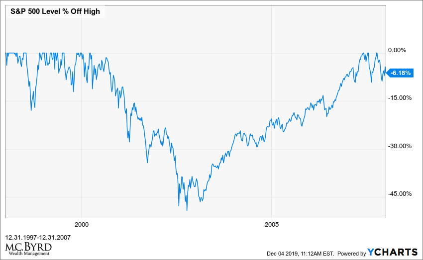
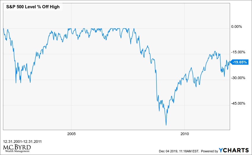
The following charts take the most expensive years and illustrate the market’s percentage gain or loss, not including dividends.
The Dow Jones Industrial Average lost roughly half its value from 1929-1939.

The S&P 500 was down 6.18% in the 10 years following 1997. The interesting thing about the 10 year return from this date is that the market had stellar returns from ’97-’99. The returns for ’97, ’98 and ’99 were 33%, 28% and 20% respectively. Euphoric valuations do not tend to stick.


Why do expensive markets deliver consistently poor results? An easy way to conceptualize this phenomenon is to imagine purchasing a small business. If you pay 2X what that business earns in a year, you are likely to receive your money back within the first 5 years of owning it, if not more quickly. If you pay 10X what that business earns, it will likely take longer. Paying more for the earnings of the S&P 500 has similar results.
Given this relationship it is no surprise that a number of well-respected research firms (Research Affiliates, GMO, Morningstar) are currently forecasting dismal 10-year return numbers for the market.
The media is currently portraying calendar year 2019 as a year of large gains for the stock market; however, I would like to point out that this portrayal is contingent upon the date of the calendar. The picture changes when we expand the data to look at the price action of the S&P 500 from September 20th, 2018 through our present date. From this vantage point we are only 6.29% higher today.
What explanation can we give for these mediocre S&P 500 return numbers? As I stated in our last two client update meetings, there are only three components of total return:
- Earnings Per Share Growth
- Dividend Yield
- Multiple Contraction/Expansion.
The dividend yield of the S&P is currently 1.85%. Earnings per share growth is falling and only makes up a small percentage of market growth this year. What does that leave us with?
Multiple expansion.
In other words, the market’s main driver has been the public’s willingness to pay more per dollar of earnings. Multiple expansion can only take us so far without earnings per share growth. A market primarily driven by its speculative component, as opposed to one driven by its earnings component, is one that increases risk and subjects investors to large amounts of volatility. If the earnings component of stock market growth does not recover, we have likely reached the end of our present bull market.
Given the data above, it is worth examining how we exited previous recessions and their accompanying bear markets. The primary policy tool employed during the dot com bust and the 2008-2009 financial crisis came in the form of tremendous monetary stimulus from the Federal Reserve, which dropped its benchmark Fed Funds rate by approximately 5% in each downturn. With the Fed Funds rate at 1.56%, achieving the same feat will be impossible. As former Treasury Secretary Larry Summers has stated, this fact will likely prolong our exit from the next recession.

With this backdrop, what prudent options do investors have available to them?
Examining Warren Buffett’s portfolio might offer a clue. While his long career in markets has been marked by success in investing in stocks and private businesses, his cash position indicates he is presently waiting for better opportunities to make purchases.

Warren Buffet’s biographer, Alice Schroeder, describes his approach below:
“He thinks of cash differently than conventional investors. This is one of the most important things I learned from him: the optionality of cash. He thinks of cash as a call option with no expiration date, an option on every asset class, with no strike price.” It is a pretty fundamental insight. Because once an investor looks at cash as an option – in essence, the price of being able to scoop up a bargain when it becomes available – it is less tempting to be bothered by the fact that in the short term, it earns almost nothing.
In the 10 years following the peak of the dot-com bust, an investor in U.S. equities, even after reinvesting dividends, would not have recovered their principal amount. Today, finding ourselves at a similar juncture, we believe it would be wise to follow Buffett and develop an appreciation for the optionality of cash.
