If you had been living off the grid since January and just turned on the television, you might be led to believe we are in the middle of a roaring bull market.
There are plenty of pundits who say that the market still has room to run, with the implication that we have had a huge surge. This has created a perception far different from reality. In fact, the Standard and Poor’s 500 has been anemic since fall of 2015 with a few “catch your breath” moments thrown in for fun.
The graph below illustrates the price percentage change in the S&P 500 since November 3, 2015.

Raging bull market? We don’t think so.
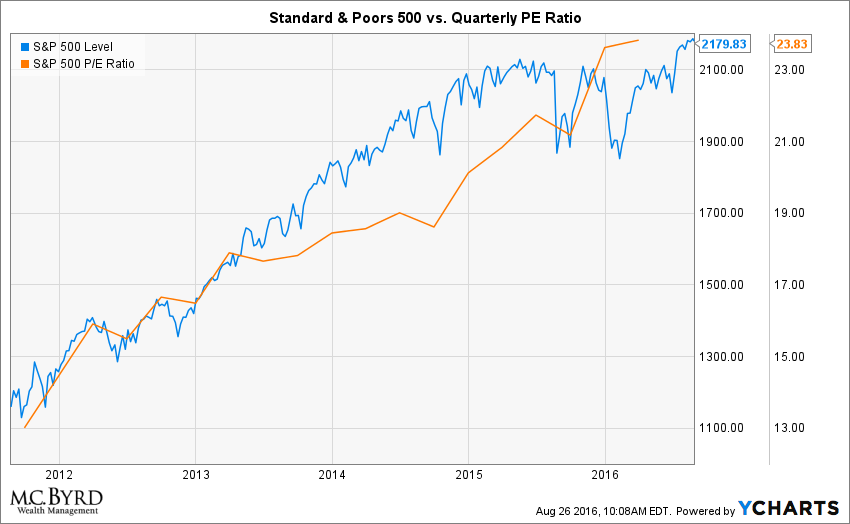
In fact the market continues to get more expensive based on the price to earnings ratio of the market. The chart below illustrates the S&P 500 and the corresponding quarterly price to earnings ratio.
So if you have been off the grid, don’t pay attention to the daily headlines. A jolt back to reality is never pleasant.